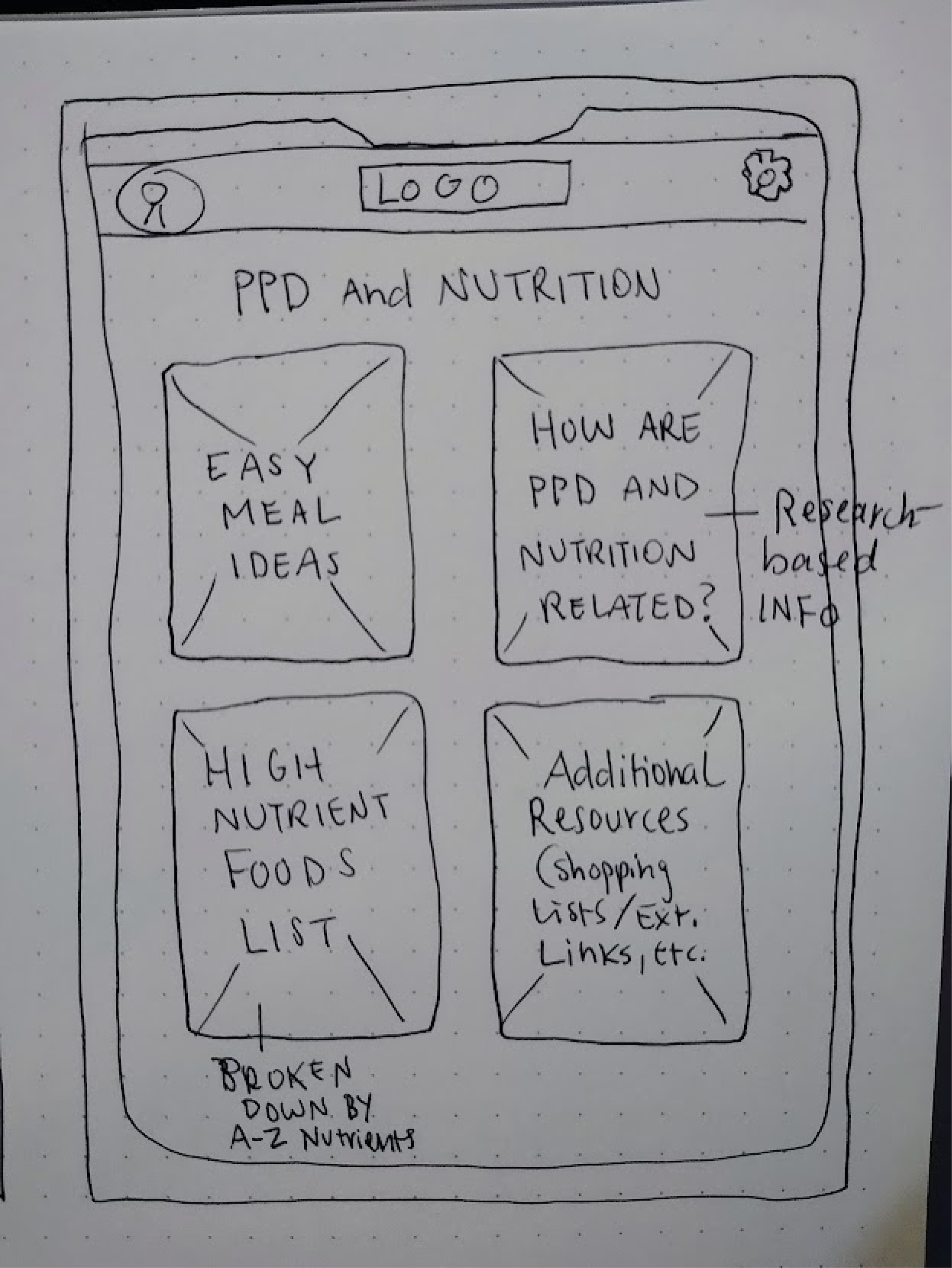
To begin visualizing the app, I created lo-fi wireframes to map out the core structure and user flow without focusing on visuals. These black-and-white layouts helped me test how users would navigate the app, from checking in on their emotions to accessing self-care resources, while maintaining focus on clarity and ease of use. It was a quick, effective way to validate the experience before moving into detailed design.
Lo-fi Wireframes