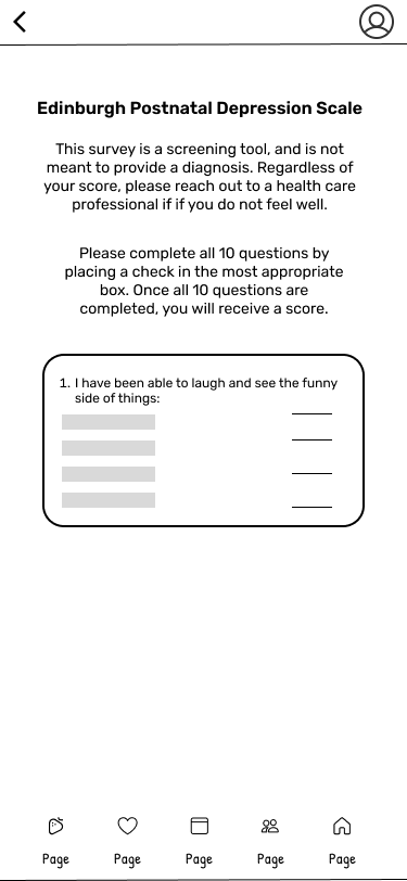
After validating the core structure with lo-fi wireframes, I moved into mid-fi to refine the layout and add more realistic content and interface elements. These wireframes helped me focus on usability—like button placement, hierarchy, and screen flow—while still keeping the visuals neutral. It was a key step in making sure the app felt intuitive and supportive before adding branding and final design details.
Mid-Fi Wireframes