Happy Monkey
Miami
Redesigning a small business website so parents can find what they came for — without the scavenger hunt.
Role: UX Designer | Team: 3 Designers | Timeline: 4 Weeks | Platform: E-commerce Website | Tools: Figma, Miro, Google Forms
01 - The Problem
A Great Store With a Website That Was Working Against It
Happy Monkey Miami sells ethically made toys for children. The mission is good, the products are good, and the people behind it clearly care. But the website was making all of that really hard to see.
The homepage tried to do everything at once and ended up communicating nothing clearly. Navigation was disorganized. Product categories were inconsistent. There was no information about the physical store — no hours, no location, no sense of who was behind the brand. For a business built on trust and values, the website was undermining both.
Parents shopping for children are not browsing casually. They have a budget, a specific child in mind, and limited patience for a site that makes them work to find what they need. The redesign had one job: get out of the customer's way.
02- Discovery
Talking to the People Who Actually Shop This Way
We interviewed parents and family members of young children — the exact people who would be landing on this site looking for a gift or a toy they felt good about buying. The feedback was consistent and specific.


Click to ViewNobody was confused about what they wanted. They wanted to find something quickly, understand what it cost, trust that it was worth it, and feel good about the brand they were buying from. What the existing site gave them was the opposite of all four.
Visual Overload
The homepage felt overwhelming. Too many elements competing for attention with no clear hierarchy to guide the eye.
Confusing Structure
Website organization made it hard to browse with purpose. Users could not find categories or understand how products were grouped.
No Store Presence
No mention of the physical location, hours, or in-store experience. For a local business, that is a missed trust signal.
Values Matter
Users actively wanted to know about the business owner and the brand's values before committing to a purchase.
$50
The median gift budget across participants. Price was not a secondary consideration — it was the first filter. The redesign needed to make browsing by price range fast and frictionless.
03- Define
Designing for the Parent Who Does Not Have Time to Guess
Research gave us a clear picture of who we were designing for. We built around Rachel: a 36-year-old interior designer, mother of two, health-conscious, and values-driven. She is exactly the kind of customer Happy Monkey should be winning over — and the kind the old site was losing.
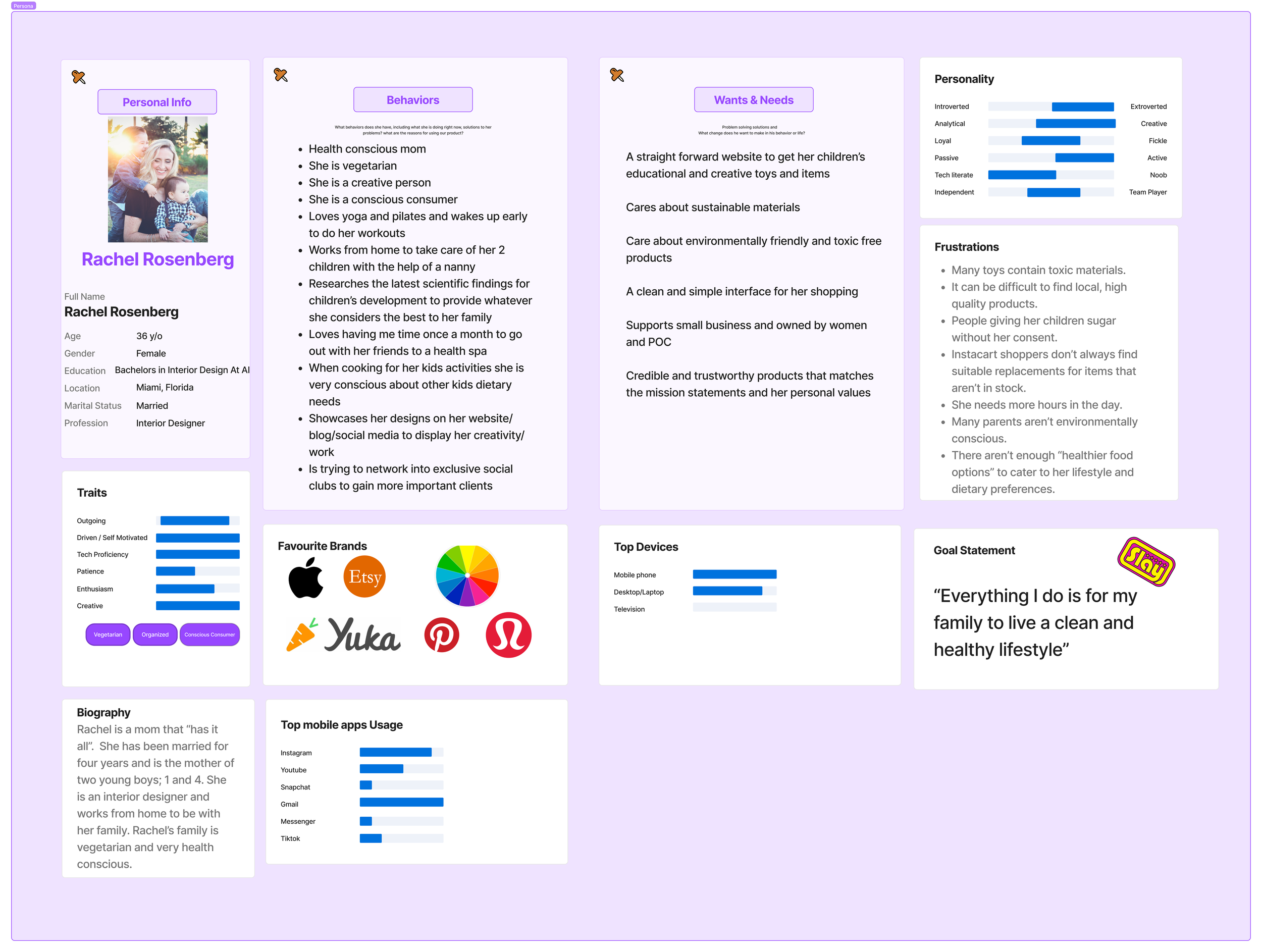
User persona · Rachel, 36, values-driven parent and gift buyer"Rachel does not need to be convinced that ethical toys matter. She needs a website that does not make finding them feel like a chore."
Her challenges were not unique to her. They were the product of a website that had never been organized around the person using it. Cluttered interfaces, unclear categorization, and no transparency about the brand behind the products.
Homepage Clutter
No visual hierarchy meant every element fought for attention. Nothing stood out because everything was trying to.
Category Confusion
Products were not organized in a way that matched how parents actually think about buying — by age, by price, by occasion.
Missing Store Info
No physical address, no hours, no in-store experience details. A local shop with no local presence online.
No Brand Story
The ethical sourcing story — the thing that makes Happy Monkey worth choosing over Amazon — was invisible.
Journey Mapping Rachel's Experience
We mapped Rachel's emotional arc through the shopping process to understand exactly where the experience broke down and where the redesign needed to do the most work.

Emotional journey map · Rachel's feelings through the shopping experience
Journey map · key steps, actions, and friction points04- Ideate
Structure First, Polish Second
The research pointed toward a clear direction: the site needed better bones before it needed better visuals. Every feature we designed was rooted in something a real user said they needed, not something that looked good in a mood board.
01- Product Organization
Sections by age, season, price range, and brand. Browsing with a specific child or budget in mind becomes effortless instead of exhausting.
02- Themed Collections
Products grouped under shared themes — Winter, Safari, Ocean — for shoppers who want to browse by feel rather than filter.
03- Gift Ideas Section
A dedicated space for gift shoppers who know the occasion but not the product. One of the most requested features in user interviews.
04- Promotions Visibility
Sales and seasonal items surfaced clearly, so users do not have to hunt for deals that are already there.
Site Map and User Flow
We rebuilt the information architecture from scratch, designing flows that reduced the number of steps to get anywhere meaningful on the site.
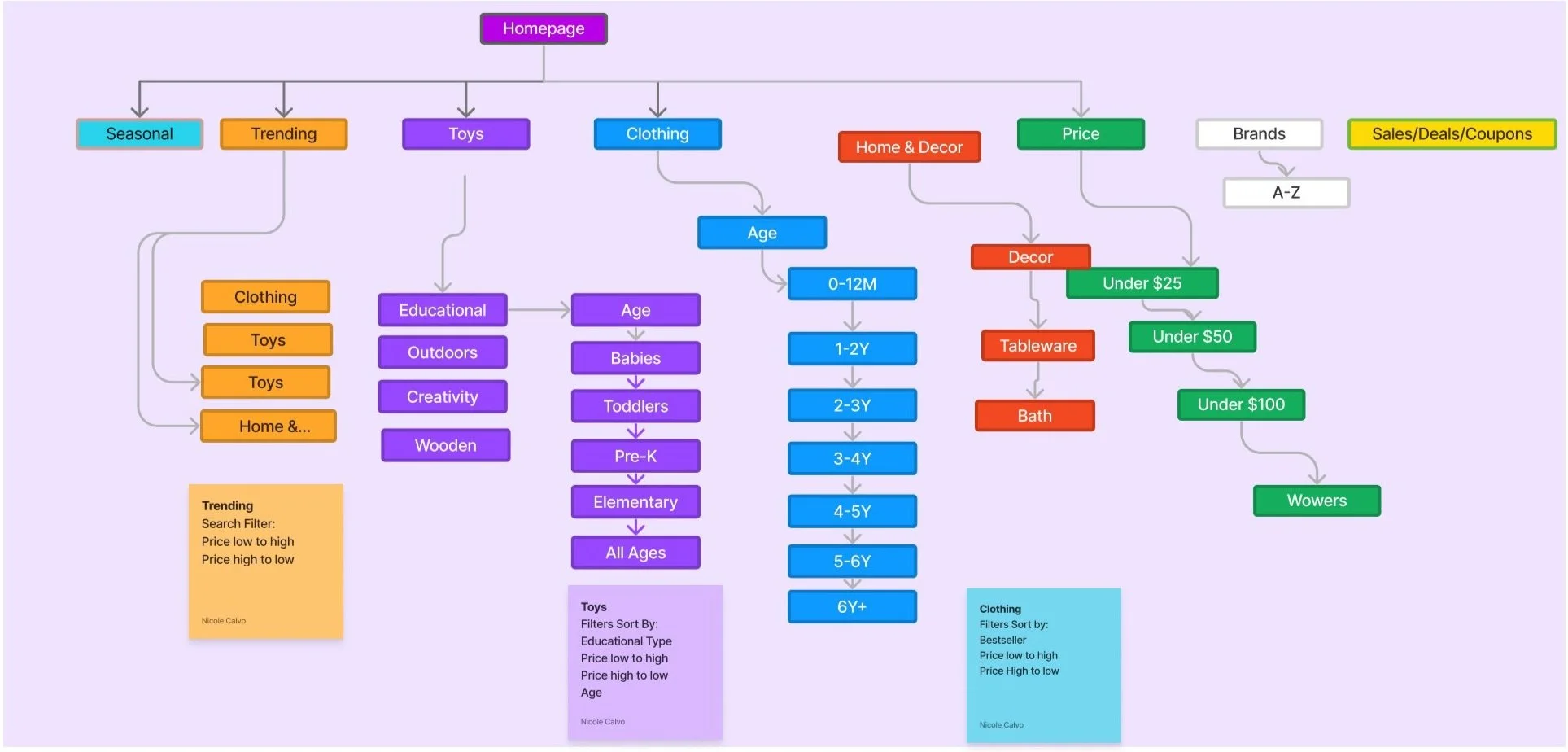
Redesigned site map · simplified information architecture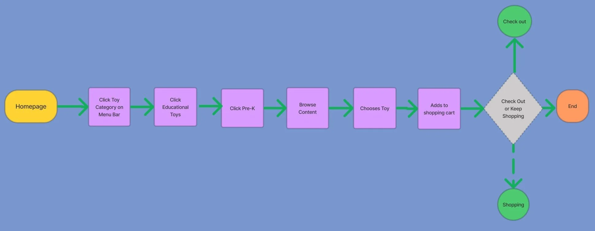
User flow · path from landing to product purchase
Lo Fi to Hi Fi
Lo fi wireframes let us pressure test the layout and navigation structure before committing to any visual decisions. Mid fi added spacing and hierarchy. By the time we moved into high fidelity, the bones were solid and the visual work had a clear foundation to build on.

Lo fi · layout and flow
Mid fi · structure and spacing
Hi fi · brand and visual direction
05- Validate
Testing Navigation, Then Fixing What We Found
Before usability testing, we ran a heuristic evaluation using Nielsen's 10 principles to identify the places where users lacked control, flexibility, or a clear path forward. That evaluation shaped which flows we prioritized in testing.
Flow Tested
Success Rate
Key navigation tasks across redesigned site
75%
Three quarters of users navigated successfully. The core structure was working. What was not working was visibility: promotional sections and themed collections were present but not prominent enough to get noticed. Users were not skipping them because they did not care. They were skipping them because nothing was drawing their eye there.
What Changed and What Is Next
We designed hover states and stronger visual cues to pull attention toward the features users were missing. The next steps are clear: make buttons interactive, refine the font and color system for readability, and give the About section the prominence it deserves — because for a brand built on values, that page is not secondary content. It is the whole pitch.
06 - What I Took Away
Trust Is Built Before the Add to Cart Button
Happy Monkey had everything it needed to win a loyal customer: ethical sourcing, quality products, a real person behind the brand, and a physical store that people actually love. The website just was not communicating any of it.
This project reinforced something I think about a lot in e-commerce design: buying decisions — especially for parents — are not purely rational. People want to feel good about where their money is going. That means the brand story, the values, and the human behind the business have to be visible and easy to find. A great About page is not a nice-to-have. It is a conversion tool.
The redesign gave Happy Monkey a structure that reflects what the brand actually is. Clear navigation, organized products, and a visual identity that feels as thoughtful as the toys themselves.