
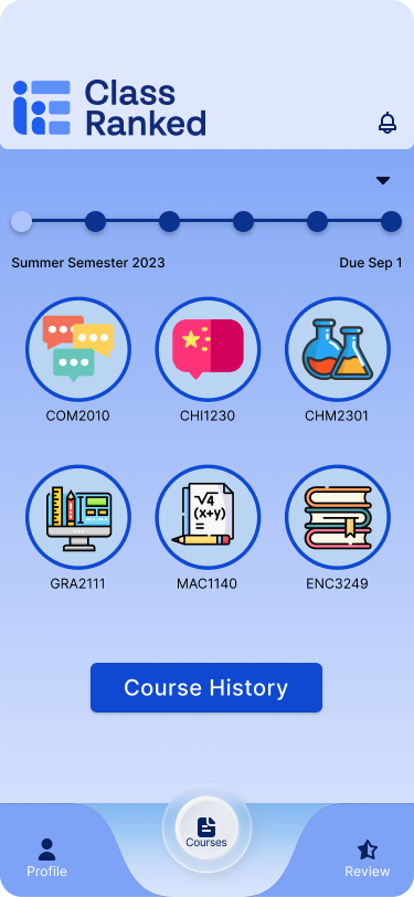
Class Ranked
Role: UX/UI Designer | Timeline: 4 weeks | Tools: Figma, FigJam | Team: 2 designers


01- The Problem
The Problem With Asking People to Care
Universities have a participation problem. Only 38% of students actually complete end of semester course evaluations, which means the other 62% see that survey notification, think yeah, not today, and close the tab without a second thought.
And honestly? You can't really blame them.
Surveys show up at the worst possible time — finals week, when everyone is running on caffeine and regret. They're long, repetitive, and the feedback disappears into an administrative void with zero visible follow through. Students aren't lazy. They just don't believe it matters. That's a trust problem, not a time problem. And trust problems need a different kind of design solution.
38%
of students regularly complete course evaluations
62%
rarely or never participate — not out of apathy, but distrust
69%
believe surveys are useful — they just don't act on it
We wanted to build something that made giving feedback feel worth a student's time. Not by tricking them into it, but by actually making the exchange feel fair. Success wasn't just higher completion numbers. It was students who actually felt heard.
02- Discovery
Talking to Real People First
Before opening Figma, we went straight to the source. We surveyed 13 students and interviewed 7 students and recent graduates about their honest relationship with course evaluations.

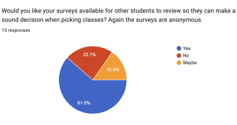
What came back was consistent: 69% of students believed surveys were useful in theory, but only 38% actually completed them. The gap between thinking something matters and doing it is exactly where the design problem lives.
The interviews made it even sharper. Students weren't checked out. They were skeptical. They had submitted feedback before. Nothing changed. The same professor had the same issues the following semester. Over time, the reasonable conclusion became: why bother?
03- Define
Naming the Friction
Four frustrations kept coming up, and they stacked on each other in a way that made opting out feel completely logical.
No Impact: Students didn't see how their input connected to anything real.
No Follow Through: Problems they flagged one semester came back untouched the next.
No Benefit: There was nothing in it for them. Completing a survey was a favor with no return.
Too Much Time: Surveys were long and repetitive enough that even the most motivated students rushed through or bailed halfway.

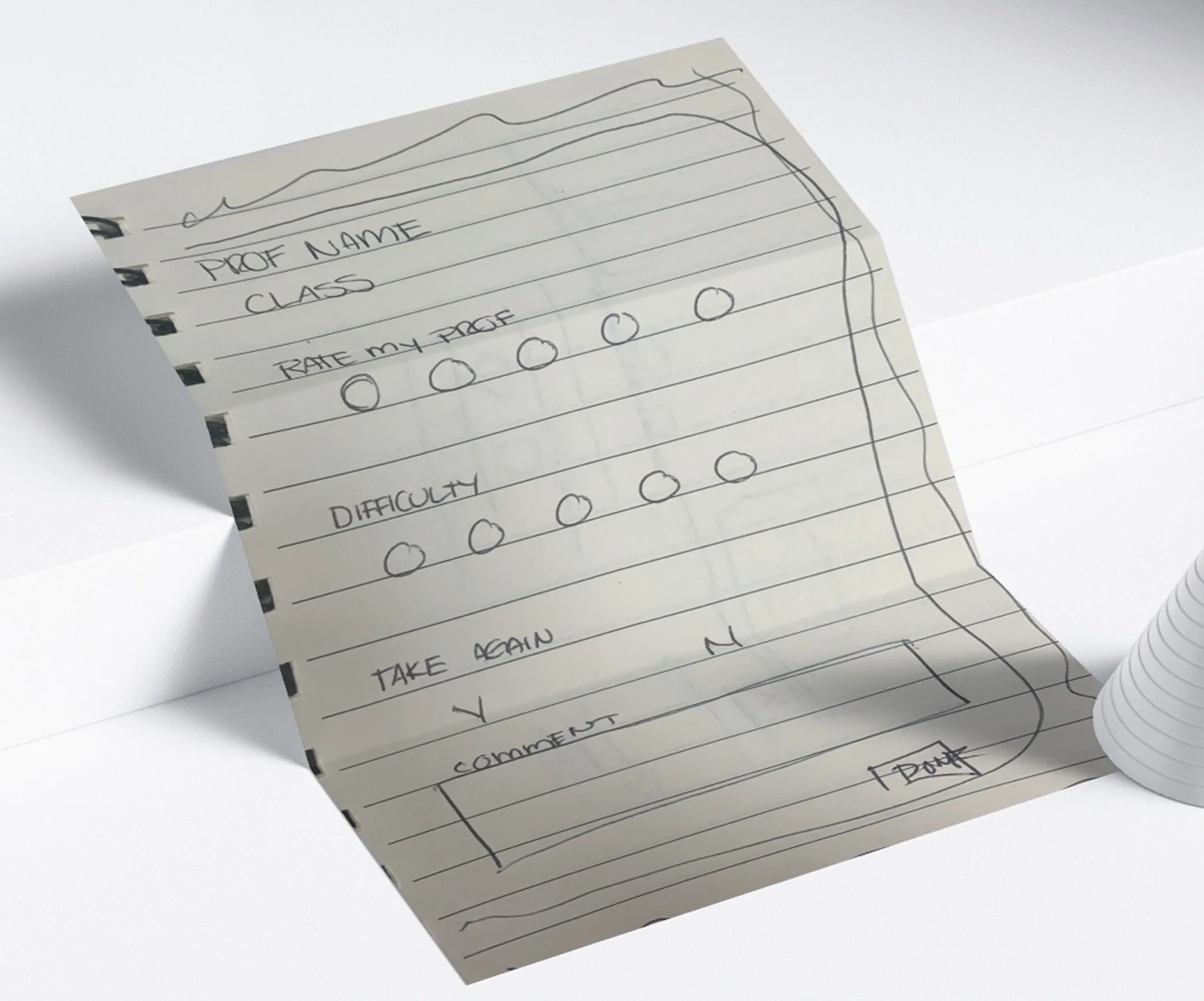
Click to view
Meet Lida
To keep the design grounded, we built around Lida — a student in a mandatory course who isn't disengaged from school, just disengaged from this specific process. Her emotional arc through the survey experience told us what we needed to know: frustration at the first notification, reluctant relief when the experience was shorter than expected, and real satisfaction when finishing unlocked something tangible.
That arc became the design brief.

Emotional Journey Map

Journey Map

04-Ideate
Four Features, One Thesis
The thesis was straightforward: participation follows perceived value. So every feature had to answer the question — what does the student actually get out of this?
Feature One
Monthly Mini Survey: Feedback while the course is still happening, not as a postmortem three weeks after finals. Feedback that still has time to do something useful.
Feature Two
Progressive Saving: Students can pause mid-survey and come back later. Dropout wasn't always about not caring. Sometimes it was just bad timing.
Feature Three
Review Access: Unlocked after survey completion. The exchange feels two-sided. You give something, you get something.
Feature Four
Non-Financial Incentives: Early grade access, extra credit, and study guides that motivate participation without putting any cost on the university.
Lo-Fi
Lo fi wireframes · structure and flow before visual polish
Mid-Fi

Mid fi wireframes · spacing, layout, and content hierarchy
Hi-Fi
Hi fi · brand and visual direction
05- Validate
Putting It In Front of Real Users
We tested three core flows. Every single one was completed in under a minute on average. Speed was a feature, not a nice to have.
Flow UsersTested Success Rate
Monthly Mini Survey 10 users 88%
Continue Survey 9 user 78%
Redeem and Review 10 users 70%
"The progress saving feature and mini surveys were the unprompted fan favorites. Users mentioned both without being asked."
The one place we hit friction was the Redeem flow. Some users stalled not because they didn't want the reward, but because the path to it wasn't obvious. We simplified the CTA and added clearer progress feedback, and the confusion disappeared.
Giving people permission to stop and come back later turned out to be one of the highest trust signals in the whole product.
Prototype
06- What I Took Away

Trust Is a Design Material
ClassRanked started as a participation problem and turned into something more interesting: a lesson in trust as a design material.
Incentives don't fix a broken relationship. They work when the experience underneath them already respects the person using it. The students who stopped showing up weren't failing the university. The university's survey design was failing them.
The difference between reducing friction and rebuilding trust is something I think about in almost every project now. If users don't feel like the product is on their side, no UX pattern closes that gap.