Class Ranked
Overview
Class Ranked is a concept mobile app designed to increase student participation in end-of-semester course evaluations. Students often avoid these surveys because they feel time-consuming, offer no immediate benefit, and rarely lead to visible change. This project focused on reducing friction and increasing engagement through real-time feedback opportunities, progress-saving features, and non-financial incentives. The goal was to create a system that benefits both students and universities by generating more timely, actionable feedback.
My Role
I worked as a UX/UI Designer on this project, leading user research, usability testing, and interaction design from concept through validation. I conducted surveys and interviews, synthesized insights into key pain points, designed user flows and wireframes, and iterated on solutions based on testing results. I collaborated closely with a UX partner throughout the project.
Problem
End-of-semester course surveys see low student participation because students often feel their feedback doesn’t lead to meaningful change. Surveys are also time-consuming, repetitive, and offer no immediate benefit, resulting in limited actionable data for the university.
Goal
Design a mobile app that encourages students to complete surveys by reducing friction, providing progress-saving features, offering optional real-time feedback, and introducing non-financial incentives. Success is measured by increased survey participation and improved user engagement with the feedback process.
Discover
To understand why students were not completing end-of-semester surveys, we conducted surveys and interviews:
Surveyed 13 students: 69% agreed surveys are helpful, but only 38% regularly completed them. 62% rarely or never participated.
Interviewed 7 students/recent graduates: Feedback revealed that students felt surveys offered no visible benefit, and the university rarely acted on their input.
Key Pain Points
From our research, we identified the following frustrations:
Lack of impact – Students don’t see how feedback improves their current courses.
No follow-through – Persistent issues across semesters create skepticism.
No clear benefit – Completing surveys feels like a one-sided request.
Time-consuming – Surveys are long, repetitive, and not user-friendly, causing rushed or incomplete responses.
These insights directly informed the design of a student feedback app that reduces friction, provides incentives, and allows feedback during the semester
Click to view
Define
Persona & User Journey
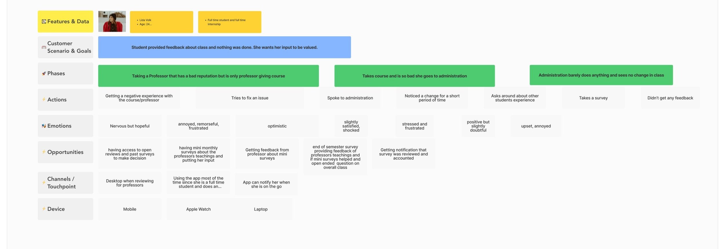
Our target user, Lida, represents students in mandatory courses who often feel that end-of-semester surveys are time-consuming and have little impact. Her frustrations include long, repetitive surveys, lack of clear benefits, and the perception that feedback is ignored. Throughout the survey experience, students like Lida feel frustration at the invitation stage, relief when features like progress-saving or shorter surveys reduce effort, and satisfaction when completing a survey unlocks non-financial incentives such as early access to grades or study materials. These insights directly informed the design of Class Ranked, guiding the app’s features, flow, and incentives to make survey participation more engaging and meaningful.
Emotional Journey Map
Journey Map
Ideate
Problem
Students often feel unheard in mandatory courses and lack motivation to complete long, end-of-semester surveys, especially when their feedback doesn’t lead to visible change.
Solution
Based on user research and pain points, we designed features to make survey participation easier and more engaging:
Monthly Mini Survey: Allows students to give feedback during the semester.
Progress Saving: Allows students pause and resume the end-of-semester survey, reducing drop-off.
Open Review: Unlocks after survey completion for detailed, free-form course feedback.
Non-Financial Incentives: Extra credit, early access to grades, and study guides motivate participation without cost to the university.
Lo-Fi
For Classranked, we created lo-fi wireframes—basic, simple layouts that focus on where key elements like buttons and text go, without any colors or detailed visuals. These wireframes helped us quickly test the app’s structure and user flow, so we could make improvements early before adding design polish
Mid-Fi
Mid-fi wireframes added more detail to the basic layouts by showing better structure, spacing, and content placement, though still without final colors or images. This helped us get a clearer idea of how the app would look and feel, making it easier to gather feedback on usability and flow before moving on to high-fidelity designs.
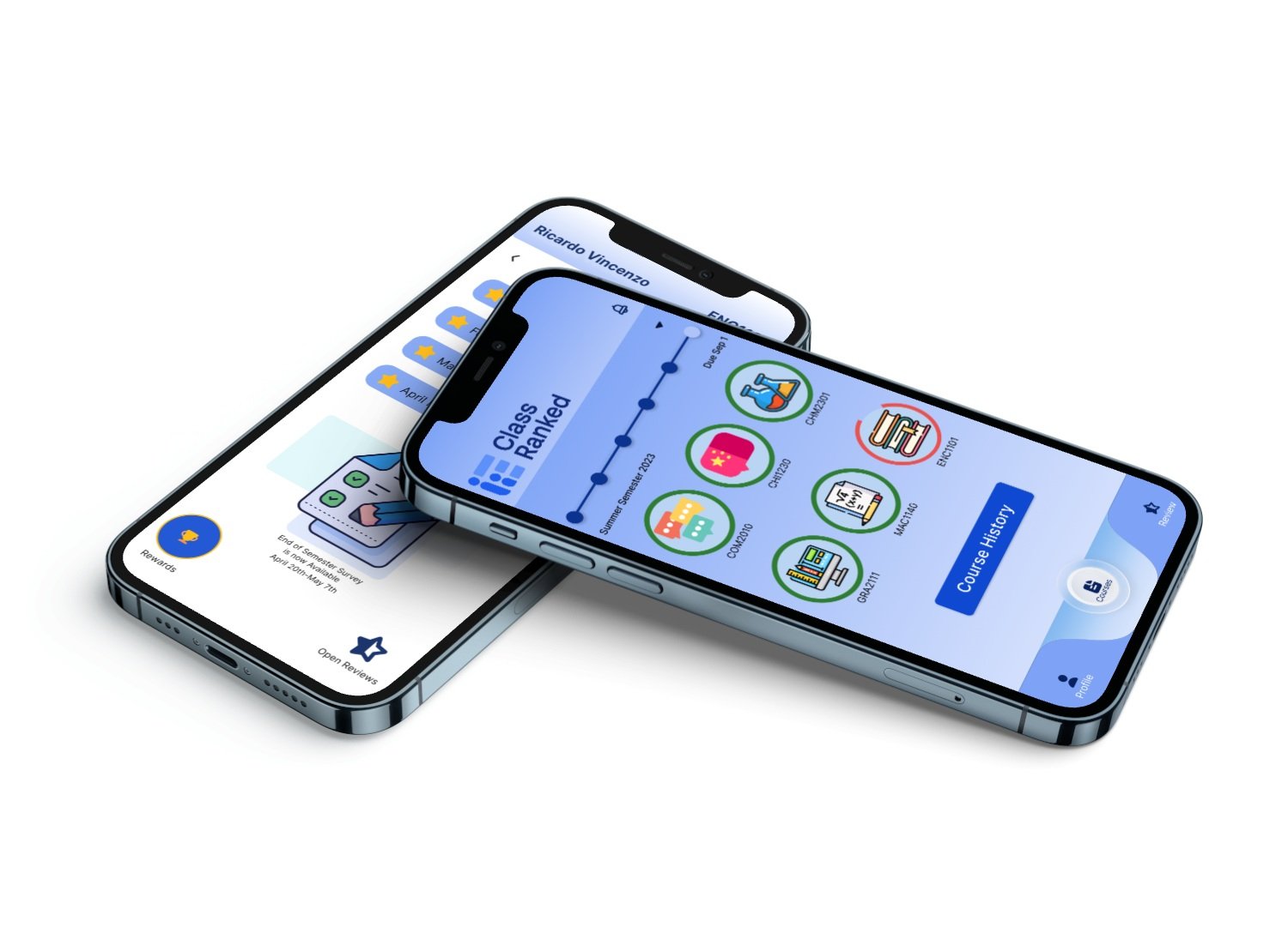
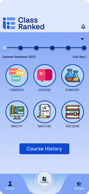
While the main case study focuses on research, user flows, and problem-solving, I also explored the visual direction for Class Ranked. This includes the style tile, component library, and high-fidelity UI screens that bring the student experience to life with a clean, intuitive, and trustworthy interface.
Validate
Prototype
Usability Testing
Monthly Mini Survey: Tested by 10 users with an 88% success rate.
Continuing Survey & Open Review: Tested by 9 users with a 78% success rate.
Redeem and Review Flow: Tested by 10 users with a 70% success rate.
All flows were designed to be user-friendly and took less than one minute to complete on average.
Insights & Iterations
Users appreciated the progress-saving feature and mini-surveys, which reduced frustration and drop-off.
Some confusion arose in the Redeem flow; simplifying CTAs and adding progress feedback improved clarity.
Visual design adjustments, including color scheme and notifications, were identified as the next steps for engagement optimization.
Conclusion
User research revealed two key insights: students don’t participate in ‘End of Semester’ surveys because they see no immediate benefit and feel the University doesn’t listen to their concerns about courses or professors. Our design for the Class Ranked student app empowers students to share feedback in real time during the semester, giving them a stronger voice. Additionally, non-financial incentives and an auto-save feature encourage survey completion without adding cost to the University.
These features work together to increase student engagement and ensure more timely, actionable feedback for improving courses.


